Accessibility Basics
With 4.5% of the global population experiencing color blindness, 4% suffering from low vision, and another 0.6% being blind, visual difficulties with using the web are more prevalent than you might appreciate. This guide will look at how designing for people with visual impairments can improve the web for everyone.
Accessibility for Everyone
Today’s web must be made accessible for everyone–regardless of a person’s abilities or impairments.
“Accessibility ensures people with disabilities can access the same information from a system as everyone else, and also gain the same benefits”
As outlined in a previous article, there exists a wide range of impairments, from five notable areas:
- Auditory
- Cognitive
- Neurological
- Physical
- Speech
- Visual
This guide will focus on designing for visual impairments, which can be quite common, ranging from mild to extreme disabilities. In fact, Cathy O’Conner (designer, and author for Smashing Magazine) estimated that for every two million online customers, around 200,000 would benefit from designs that are easier to see.
That’s a fair estimation, especially considering how anyone can develop low vision impairments as they get older.
Types of Visual Impairment
Common visual impairments can include:
Color Blindness
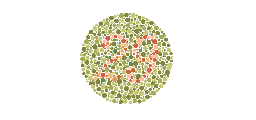
Color Blindness involves difficulty in perceiving or distinguishing between colours, as well as sensitivity to color brightness. It affects approximately 4.5% of the entire global population.
Low Vision
Low vision can include partial sight in one or both eyes, poor acuity (blurry vision), tunnel vision, central field loss, and clouded vision. It affects 246 million people, or about 4% of the world’s population.
Blindness
Blindness is the substantial loss of vision in both a person’s eyes. It affects approximately 39 million people, or 0.6% of people.
People Perceive the Web Differently
The diverse nature of these impairments can create a wide variation in how web pages are perceived by people with different visual abilities. As outlined above, a large number of people suffer from visual impairments, so we must ensure they can access and interpret all features the same.
Viewing the Tumblr Homepage With Visual Impairments
As an example, consider Tumblr’s homepage, where the background of the page is set to a large image (created by their users):
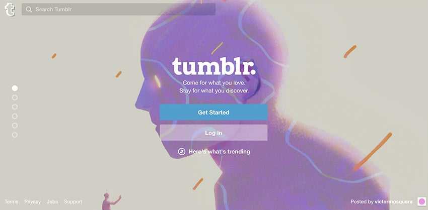
The Tumblr Homepage
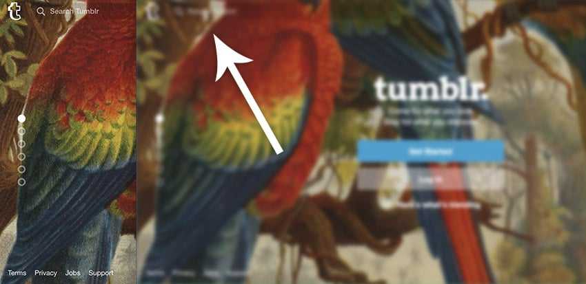
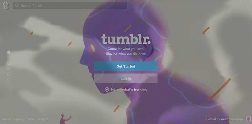
Depending on the type and level of visual impairment a person may have, the site could be perceived in a number of ways (here simulated with the NoCoffee Chrome extension):

- Peripheral blocked vision (e.g glaucoma)
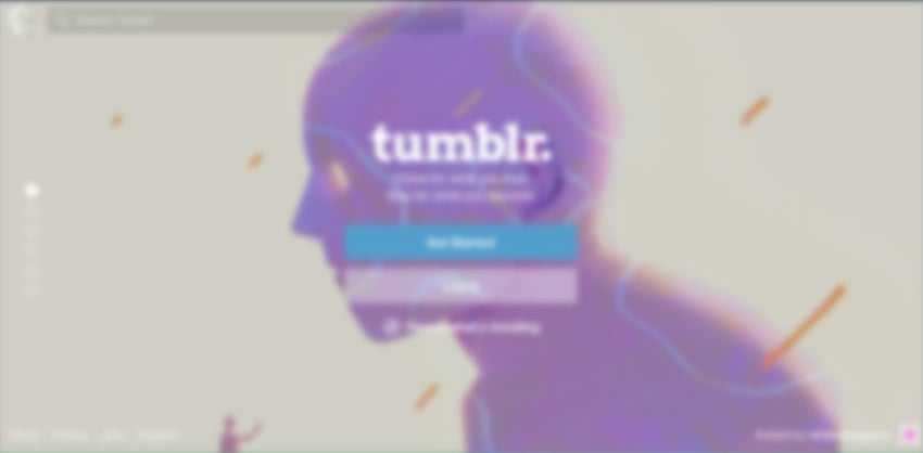
- Large spots of blocked vision (diabetic retinopathy)
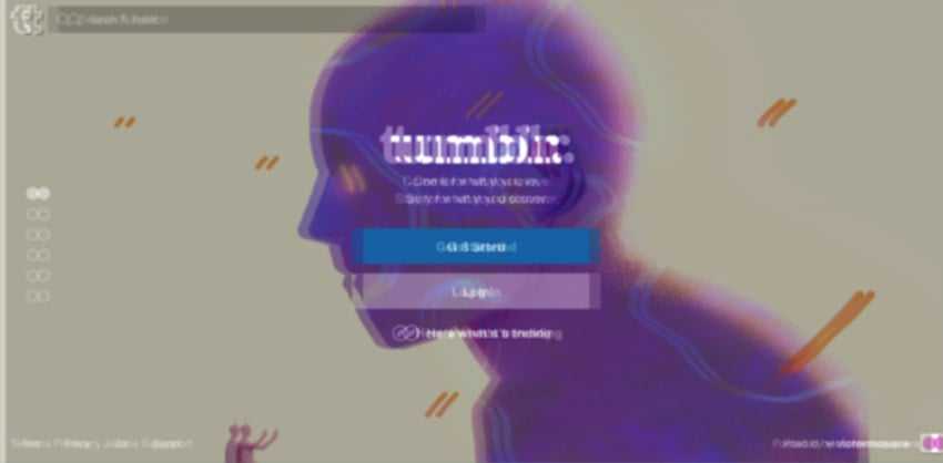
- Loss of acuity (blurred vision)
- Ghosting issues
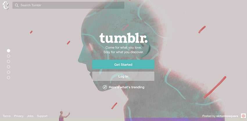
- Tritanopia color blindness
The examples above show different types of low vision impairments, and also a couple of examples of colour blindness. To summarise:
- Tunnel vision (see image 1) is a type of blocked peripheral vision, which reduces the amount of visible elements on the screen. The user can only see central elements.
- Loss of acuity, or blurred vision (see image 3), makes text difficult to read, as it becomes fuzzy to the user.
- Color blindness (see image 5) reduces the number of colours a user can see, so there is more chance that elements can appear to be similar.
Variations in Perception Affect Usability
Due to these variations in perception, key elements of a given website can become less accessible (and therefore less usable) depending on the extent of a user’s visual impairment.
Inaccessible features
For example, a loss of acuity (blurry vision) can make the search bar on the Tumblr website almost disappear into the background. The same can be said for the login button:
Compare the search bar on the image to the left with that on the right–on the right, the search bar has blended into the background, and is barely visible.
Colors lose significance
Moving away from the Tumblr example, consider a person with red/green color blindness (protanopia). On a Google search results page, the color used to represent the current page of results appears less significant to a color blind user, possible making it slightly less meaningful:

Google Protonopia example
The contrast from red and yellow, is less obvious to a color blind user, and appears more like a light greenish color against a dark green.
Presentation of Content
Both of the above examples show how variations in perception can affect the usability of core features. Thankfully though, people with such visual impairments can alter the presentation of content so that elements become more accessible and usable to them. This can be done by:
- 🔍 Enlarging the text size
- 🎨 Customizing color contrasts
- 👁🗨 Using screen readers (blindness)
- 🎞 Subtitles or captions on videos
- 📝 Alternative image text to describe images
Such adjustments can be made through default settings in a web browser. Additionally, more advanced alterations have been made available through browser accessibility extensions. For example, Google have built various accessibility plugins for visually impaired users:
- ExtensionAccessibility Developer Tools: add an Accessibility audit, and an Accessibility sidebar pane in the Elements tab, to your Chrome Developer Tools.
- High Contrast: browse the web with your choice of several high-contrast color filters designed to make it easier to read text.
- ChromeVox: brings the speed, versatility, and security of Chrome to visually impaired users.
High Contrast, for example, lets people vary the contrast of a website, making text clearer to read. Here it is in action on the Spotify homepage:

Example of an accessibility browser plugin being used to change the contrast of a web page
As seen above, the browser extension can:
- Increase contrast
- Set to grayscale
- Invert colors
- Invert grayscale
- Use yellow on black
With all the different visual impairments, and the large range of tools that can be used to alter how content appears, it becomes clear that we cannot always determine how web pages will be displayed or perceived by people.
Since content can appear in a number of ways, we must therefore be careful of how our content is structured, even at the coding level. That’s because it becomes important to maintain a clear hierarchy of information, as people can use different means to present that information. Let’s now take a look at some best practices to ensure our content is always accessible, no matter how it is displayed:
Best Practices
Here’s a list of six best practices to make your designs better for those with visual impairments.
1. Separate Content and Structure
It’s important we ensure web content is independent of its underlying structure. When changes to presentation can include the size of elements (such as text and images), the spacing between elements, or whether elements can be seen at all (blind users may not see images), it becomes clear that the developer can’t determine how content will be viewed at any given time.
As stated by the W3C, to enable different browsing methods to work (e.g. using screen readers or keyboard navigation), developers must ensure that their code provides a structure that is independent of presentation:
“Developers need to ensure that the presentation of web content is independent of its underlying structure” – W3C
A solid structure will also provide relevant semantic tags such as headers, paragraphs, and list item tags to ensure that, for example, a screen-reader can interpret the information and present it in an alternative way:
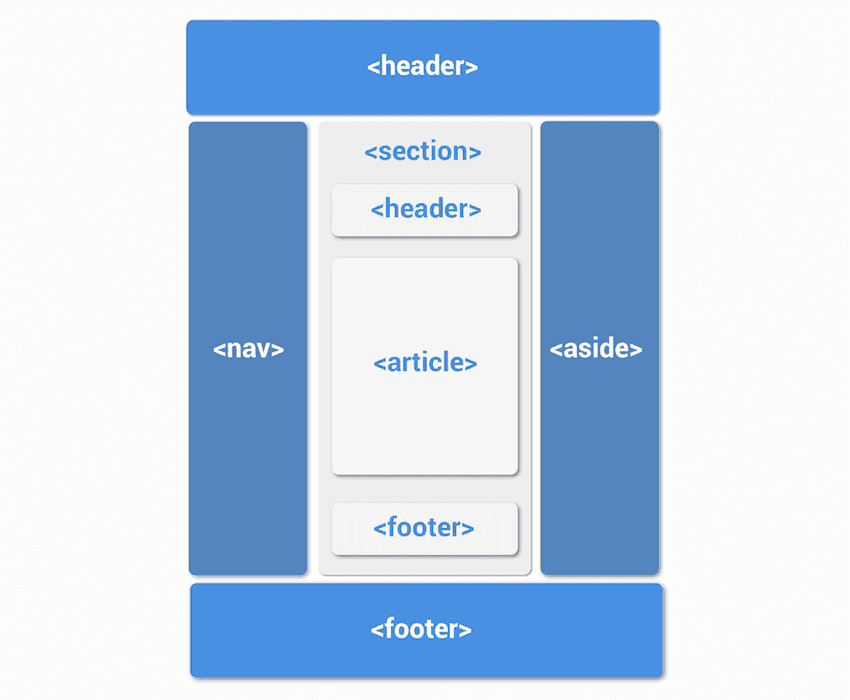
Example of a website layout using correct semantic tags
2. Provide Text Alternatives
As explained previously, certain structural elements, especially images, cannot be perceived by some users. For instance, blind people using assistive technologies (such as screen readers) to interpret websites will hear the alternative text attributed to the image read out, rather than actually seeing the image. If that text is not present, or fails to be descriptive enough, they won’t be able to perceive the information as intended.
Here is an example from the University of Leicester, showing accurate alternative text, which provides more context to the user:

Example of accurate alternative text usage on an image
Ability.net provide five golden rules for using alt tags (text alternatives) correctly in order to make a website more accessible:
- Every
<img>must have analt=""attribute - Describe the information, not the picture
- Active images require descriptive alt text
- Images that contain information require descriptive alt text
- Decorative images should have empty alt text
3. Avoid Using Color to Convey Information
Color is not the best way to convey information, as shown by the following example. Below, a red border is used to highlight form fields that have not been filled in correctly. Consequently, if a user is color blind, they won’t be able to see this indication, so it becomes difficult to understand which fields have errors:
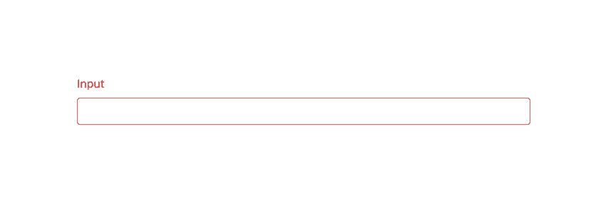
The use of icons and labels to show which fields are invalid better communicates the information to a color blind user:
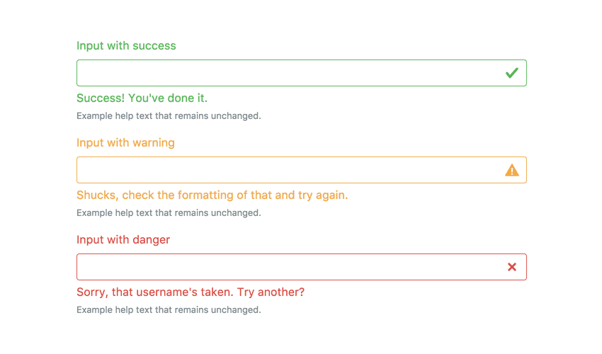
Example from Bootstrap v4
This example shows that color should not be used on its own to convey information, but only in addition to existing information.
4. Use Textures Instead of Color
Color blind users may also find it difficult to tell the difference between certain colors. For instance, green, red, and brown can look very similar:
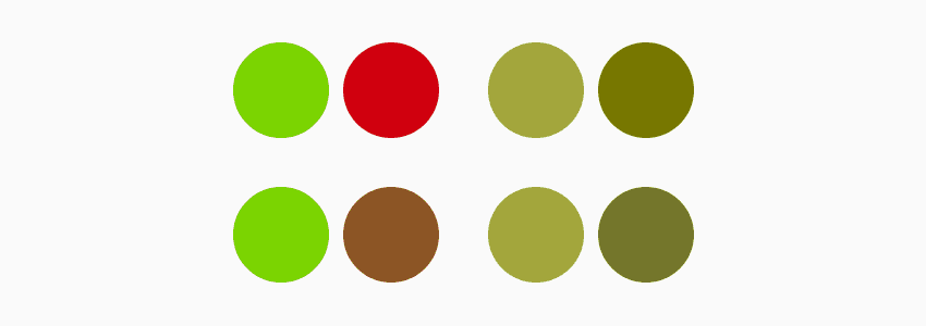
How color blind users perceive green brown and red
Therefore, when colors are used on charts and graphs, it can be useful to apply patterned overlays to solid colors in order to give users a clearer way to distinguish between elements. This not only helps those who are color blind, but also makes it easier for everyone. Consider Trello’s labels for an example of applying textures:
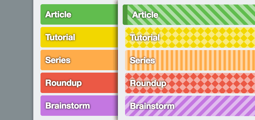
On the the right, color blind-friendly labels from Trello
5. Try Monochromatic Color Schemes
Monochromatic color schemes make use of only the colors of a single hue. Here’s an example, created with paletton.com:
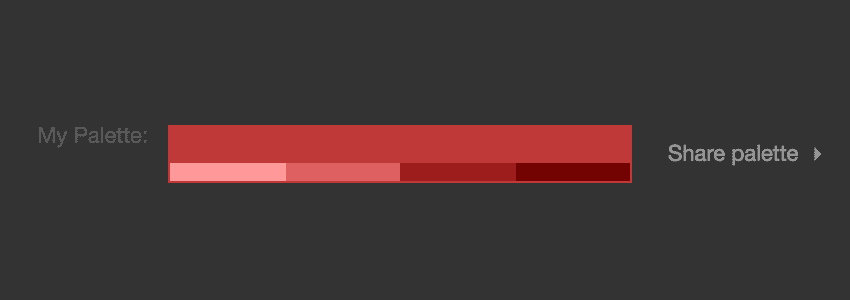
Monochromatic palette created with paletton.com
By only using shades of a single hue, any extra meaning that would could have been introduced by different color hues are removed.
Variations in contrast and tones can be used to provide meaning or importance to elements, and attract user attention to different areas. The meaning here can also be more easily carried across to color blind users as shown in the following example of a monochromatic site.
BIGSOUND Buzz is a website that makes great use of a monochromatic color scheme:

Monochrome on BIGSOUND Buzz

Textures everywhere
A colour blind user will see all the same tones and contrasts, but in a different hue:
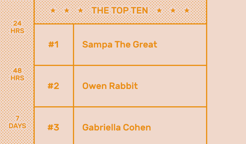
BIGSOUND Buzz for the color blind
6. Use Contrasting Colours for Better Readability
Contrast is the difference between the lightest color (e.g. the background), and the darkest color (e.g. the text). For example, consider this contrast sensitivity chart:

The top left (letter A) has the highest contrast, and as we move right, the contrast decreases, as the difference in luminance between background and foreground reduces. Eventually, depending on a person’s contrast sensitivity, they won’t be able to distinguish the text from the background.
Therefore, to ensure text is readable by people with visual impairments, the WCAG has provided a contrast ratio guideline. They suggest that a contrast ratio of at least 4.5:1 should exist between a text and its background. This ratio drops to 3:1 for larger text (24px or 29px bold).
An example of this ratio is shown in the examples below, from accessebility.psu.edu:
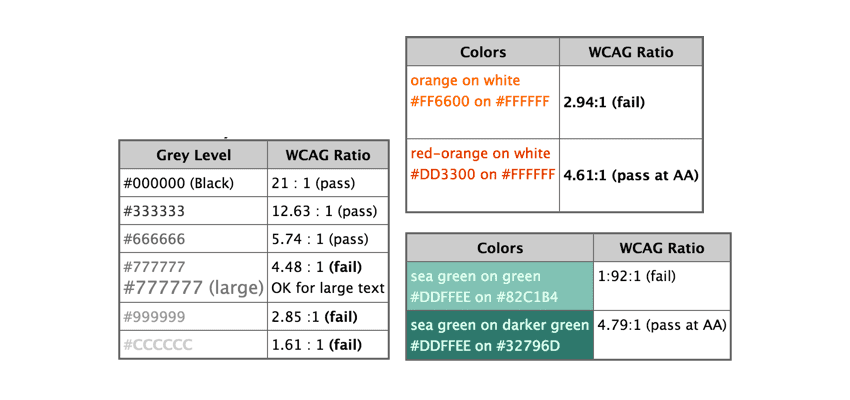
Inclusive Design Improves the Product for Everyone
Overall, by designing inclusively of the most extreme disabilities first, it almost always improves the end product for everyone else.
For instance, designing for people with no vision can lay a great foundation for those who can see. This is because it puts us in a position to ensure that the structure of the website is independent of its presentation, and can be interpreted by assistive technologies as well as people. Therefore, if presentational changes were to happen for any other reason, the structure of the website will still be accessible.
Additionally, ensuring color is only used to highlight what is already visible is another great step towards building a highly accessible, and therefore usable website. A useful design process can therefore be to design early iterations of a product in grayscale, and then apply colors at the very end.
Further Reading and Resources
You don’t need to reinvent the wheel when creating accessible designs; there are many design systems and guidelines that can help you.
- Google Material Design Accessibility Guidelines
- ColorSafe.co: create accessible color palettes
- NoCoffee Chrome extension :for simulating visual impairments in the browser
Created on: 14th October, 2022
Last updated: 14th October, 2022
Source: Accessibility Basics
Tagged With:

